Why We Changed Our Interface & The 5 Core Principles Behind Our Thinking.
18 Sep 2018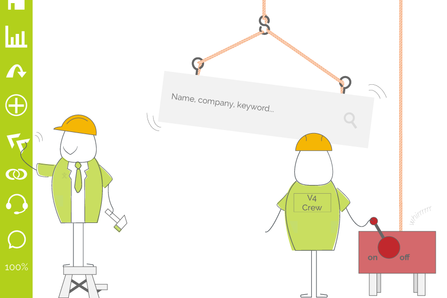
As we venture towards Q4 of 2018, here at OpenCRM we have some pretty big and exciting changes coming to our system. In the coming weeks, you will hear more and more from us about our latest version, Version 4, which we’ll often abbreviate to ‘V4.’
Like all software providers, we provide regular updates and new releases to our product and you will have likely been part of that upgrade process.
But why is V4 more than just ‘another update’ to us?
Version 4 is the culmination of over 2 years worth of detailed work, bringing a complete overhaul to the interface and experience our users get when using OpenCRM. Whilst OpenCRM Version 3 has by no means been standing still, we felt it was time for a bigger change – it was time to bring in some new ideas and overcome some of the biggest challenges which were put in front of us!
So, what caused us to act?
Put simply, evolution.
OpenCRM is now 13 years old; naturally we’re a different company to the one founded back in 2005. Firstly, we operate in a completely different technological landscape, one that is almost unrecognisable to that of the early 2000’s. We have also grown in size and those new people have brought us fresh and updated ideas to shape the future of OpenCRM. And we now have a product that is far more mature as a result of that growth and team collaboration, packing in a range of new and exciting features and updates.
We began with a system that prided itself on simplicity. Our ‘big button’ approach was very intuitive and easy to pick up and gave users a system they could feel at home with straight away. As the system became more complex, we added many, many new features which in turn all needed their own interface and often, their own buttons.
In the end, more buttons (and in turn, complexity) began to bloat the interface and undoubtedly lead to a slightly overwhelming experience. It’s true, we had outgrown ‘simple’ but in turn, we realised we may have also started to outgrow ‘easy’.
At launch, the design style also followed that of many other market leaders. As the time has progressed, it’s fair to say that OpenCRM also began to feel a little dated.
With the need for change confirmed, it was time to put this into action. We followed 5 key principles in the process of changing our interface, these 5 principles forming the basis of what is now OpenCRM Version 4.
#1 – Reduce Visual Overload
With the bloat identified, we knew we had to remove some of the visual overload from the screen, especially in key areas such as the Companies and Contacts modules, the central place for managing client Account Management.
Firstly, we went about combining the Module Tabs and Widget Bar into a single Navigation Bar housed on the left of the screen. This modelled some of the best practices for User Experience in the industry, as well as giving us the opportunity to streamline the functionality into something which was not only feature-rich, but looked completely natural on screen.
We took to reducing the amount of buttons within the system too, incorporating selected Action Buttons from feature-heavy modules into a common ‘More’ button for easy access. The last thing we wanted to do was lose functionality, but wanted to be economical with the screen space and through consultation with users, identified the Actions which would require precedence.
The result? A cleaner screen design with less distractions and more targeted approach towards functionality without the overload that iterative development had produced.
#2 – Retain Familiarity
It’s easy to focus on the areas of improvement and forget about the things you do well. Through the whole process we reminded ourselves of the thousands of customers who like the way OpenCRM works and incorporate the system heavily into their working lives.
We worked to ensure the OpenCRM we all know and love was still there and opted to keep the general layout of the system largely the same. For those customer’s transitioning from Version 3 to Version 4, of course you’ll notice the differences, but you won’t lose that familiarity. Areas such as Categories, Search and Views are all housed and operate in the same way so there won’t be too much scratching around asking ‘where’s my stuff?’
The result? We weren’t trying to reinvent the wheel, rather add some new alloys and increase the RPM – OpenCRM remains familiar but incorporates a clean, modern design. Big wins all round!
Want to take it for a test ride?
Nothing compares to trying out a piece of kit for yourself. Click to sign up for a free trial and see if OpenCRM has the look and feel (as well as the features and functionality) that you're looking for.
try it out#3 – Data Accessibility
The model CRM system and it’s role in the workplace has evolved massively over the past 25 years but some core requirements still remain. One of the simplest of these requirements is a system that needs to present data in a way that is accessible and easy to understand for the end user.
When updating the design. we had to keep that thought front and centre and ensure we did the basics as well (if not better) as those around us. Technologically we can store and present data pretty easily, but how did it need to look on screen for maximum impact?
We worked through a number of design styles, matching together colours, fonts and formats to give an output users loved whilst aligning against the OpenCRM brand we have spent many years building. As Kermit the Frog once put it, “it’s not easy being green” – but we really do quite like it. Whilst OpenCRM is still green (for the meantime) the presentation of the interface has benefitted from better colours and richer fonts to make easy presentation of data a pillar of Version 4.
The result? Going back to the core requirements of data presentation meant a streamlined and enhanced view of design styling, bringing together new colours, fonts and formats for the best end result.
#4 – Consistent Guidelines
With design such a key element in shaping Version 4, it gave us a real opportunity to set a hardened policy around design styling and guidelines. As you would expect with a new and upcoming product, in the beginning, designing sometimes became a little ‘ad-hoc,’ with areas of the system sometimes lacking in a consistency of approach.
It was time to change that and put into place a rigid and documented set of design guidelines to ensure a complete consistency in visual performance. Every pixel has to be measured, every colour properly matched and every font rigorously studied to ensure the new quality standards we set ourselves against were met.
First impressions really matter to us, both for new and existing users, when first setting eyes upon Version 4. A visual product overhaul was more than just an end result for us, it became a mind set – one which drove us to be disciplined and critical with ourselves throughout the development process.
The result? A consistency in approach across Version 4 – bringing together all features, be they 10 years, 5 months or 2 days old, under one, unified design approach.
#5 – Leverage New Technologies
To deliver the frontend improvements, the foundations also has to be rebuilt and Version 4 gave us the opportunity to investigate and adopt new and exciting technologies. A product that began life in 2005 is naturally going to be based, at least in part, on the capabilities it once had over those which lay ahead.
New technology not only changes what we can deliver on screen, but also the way it is delivered. Optimising the design gives a far greater user experience, but also a much faster one. Version 4 is more efficient in the way it provides a service and as this becomes common place for all customers over the near future, users will see an improvement in the performance they receive.
Not only did new technologies become a foundation for this version, they became an enabler for our future. The overhaul behind the scenes has completely reshaped our roadmap for the better, bringing new and exiting features far closer than we had initially forecast. Whilst Version 4 may be a new and exciting step for OpenCRM, it’s really only just the beginning. As 2019 fast approaches, it’s an exciting time for the product and all of us here and we’re excited to take the journey with you.
The result? A better OpenCRM, one which is more streamlined, modern and evolved. But it’s only the beginning, new technologies mean many new capabilities coming to OpenCRM very soon – watch this space!
Before I got my start in the tech industry as part of Apple’s UK Mac launch team, I was a professional drummer (notice I didn’t say musician). But once I got in, I was hooked and I’ve been involved in the tech industry, primarily software development, for over 35 years. I founded this company and I now have the enviable title of System Architect (as well as Managing Director) here at OpenCRM.